If you search for how to write a good or bad business intelligence report in Google, you’ll be surprised how little information comes up. The search is dominated by articles about selecting your BI platform but not actually how to deliver a good business report. So we thought we’d take a look at the most common mistakes we’ve seen over the last 25 years of delivering business intelligence solutions into a wide range of businesses across the rental and construction industries.
1. Not Understanding the End User’s Reporting Goals
The Number 1 issue that we see repeated time after time across businesses is the report builder doesn’t understand the end user’s goal. It is particularly apparent when reporting is centrally controlled by the IT department and the user who actually needs the report has to submit a request to IT and then waits for the report to be produced.
This scenario has a huge number of potential pitfalls, not least the fact that business terminology and database terminology are often incompatible so that when the user asks for information in business terms, IT has to struggle to translate the requirement into something meaningful. It’s not just about finding the right fields, a business user may be comfortable with what an “ROI report” means, but an IT user may have no understanding of “ROI” in the particular context of the business. ROI on a customer; for example, would be calculated very differently to ROI on a piece of equipment or a building.
Communication is obviously one solution to the problems above, some companies attempt to resolve the problem by having report request forms that have to be filled in in detail with examples and screenshots before the IT department will touch the report request. Alternatively, we frequently see pushback from users wanting to take control themselves and write their own reports rather than having to wait for action.
2. Not Enough Reporting Training
Okay, needing training may sound obvious, but there is a big difference between being trained on a reporting tool and being able to use it. When you implement something like a CRM system or an ERP application, it tends to be something that you spend a great deal of time in. So when you receive training you can go and start using the system right away and because you’re using it daily, regardless of a steep learning curve.
Reporting tools are slightly different. Unless your primary role is a reporting analyst, the chances are that reporting tools are something you use maybe once a week, or maybe at each month-end, but you don’t get the same level of regular exposure. Report generation is unlikely to be a number one priority which displaces everything else on the user’s to-do list–it’s likely to be the opposite: the non-essential piece that keeps getting bumped down the list.
If you are investing in training for your users we strongly recommend that as well as the training course, you arrange a series of follow-up internal sessions, ideally every day, for a number of weeks after the session to allow your users to develop familiarity with the tool you are using. All too often we see training sessions repeated to the same person or group of people multiple times because they’ve simply not had the opportunity to use the tool and have forgotten what they learned.
3. Overcrowding Your Dashboards
There is a temptation when you are creating reports to throw all the information that might be useful onto the page or screen. If your report is going to be printed, then you need to make sure it fits onto the normal width of paper your organization users. There is no point in having something that requires the end user to either print it so small it’s eligible or has to invest in a roll of sticky tape to join it together. This generally means you need to think about having only the most relevant data visible.
Of course when people start looking at reports on a screen rather than printing them there is a tendency to think that this gives you more freedom over the number of columns. Don’t get tempted to add too many columns, anything that a user has to scroll for is essentially lost information. Every web page designer understands that what the user sees on screen the moment they open the screen is the most important piece. Consider putting your headline numbers at the top of the page and not right at the bottom.
Overcrowding the screen with information doesn’t make it easier to read or more comprehensible it just adds to the confusion. If your reporting tool lets your user create their own view of a report then make sure you train your users on how to use that feature. If they can hide the 10 columns they don’t really care about, or re-sort them to show the most significant pieces in the first few columns it will make a substantial difference.
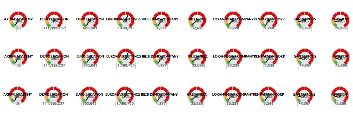
4. Using Ineffective Visualizations
Just because your reporting tool has some clever graphing options don’t be tempted to use them. A clean looking report is easier for your reader to comprehend and strengthens your message.
Pick the right kind of graph for the volume of data. Pie charts, Bar charts and column charts with more than a dozen or so values become very difficult to read. Don’t be tempted to use every color of the rainbow. Simple color schemes with well-chosen highlights are much more effective. Don’t overwhelm the user, four different ways of seeing the same information may be great as a proof of the power of your reporting tool, but it doesn’t change the basic information in the report. They only need to see it once.
There are some graph types that many people just don’t get like area charts. Stick to more common types if your audience is very varied.
5. Avoid Using Excel as Your Only Business Intelligence Tool
Excel, Google Sheets, and Access are all great tools for helping you look at information. For many end users these types of tools are more user-friendly than other reporting tools because they’ve been using them for many years.
What you need to do is avoid Excel becoming your sole reporting source, the base data that goes into your spreadsheets needs to come from a reporting solution. Once a spreadsheet is let loose into the business it tends to have legs of its own. Other people start changing formulas, add in data that doesn’t exist in your core system, before you know it the original data has disappeared and you have something entirely different.
That is not to say that spreadsheet don’t have their place in a total reporting environment. Giving accountants access to GL data in Excel format is by far the easiest way of keeping them happy, but don’t make it the norm for everyone in your organization. Ultimately it’s not the most efficient way of managing your end user base.
In summary, however you approach your reporting requirements, the most important outcome is that you deliver the reports that your business needs to run and its management need to make decisions. Talk to one of our experienced analysts for help building the right reports and dashboards for your business.